Iconic Ads: Jenson & Nicholson – Whenever you Think of Colour
Rumour
Rumour has it in the 1970s, Rediffusion had made a pitch to Asian Paints, & they loved it. They were inclined to give Rediff the account, but when asked why Gattu was missing from the creatives, Rediffusion replied that Gattu had lived his time & needed to be dropped. The meeting ended abruptly
Sometime later, Rediff re-presented the same campaign to Jenson & Nicholson. It was the “Whenever you think of colour, think of us” campaign. (this story is not verified and my sources in Asian Paints question its veracity)
The Actual Story
But there is a believable story though.
Rediffusion had won the Jenson and Nicholson’s Robbialac Emulsion paint business earlier. They had pitched for it and won it with a black and white campaign to run in dailies.
With their print campaign for Robbialac Plastic Emulsion wall paints, Rediffusion had again created history by allowing customers to visit actual houses painted with Robbialac Plastic Emulsion to see for themselves the washability, durability, and colour variety.
Now Jenson and Nicholson wanted an outdoor campaign. The Rediffusion office in Calcutta (then it was not Kolkata) did not have a telephone. They had an arrangement with a store below, the number of times Subash Chakravarty, the branch director could call. He had to call frequently as all creatives were centralized at Mumbai. And he was running out of excuses to the client for postponing deadlines.
Both Arun Kale and Kamlesh Pandey at Mumbai were over worked and frazzled with the work load coming from centralization.
Both Arun and Kamlesh were taking a leak in the toilet, wondering what to do when Kamlesh said “Kale Saab, I am solving my problem once and for all by creating a line, ‘Whenever you see colour, think of us’. And since everything in life is colourful, your job too is solved once and for all because you can virtually put anything as a visual with my line.” (for the record, Arun was Kamlesh’s senior at JJ School)
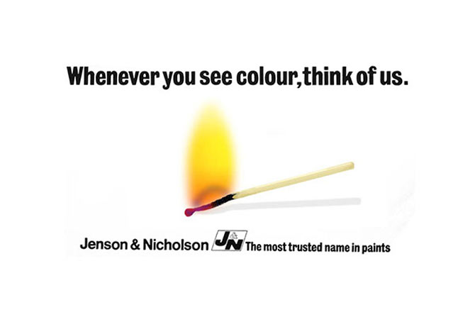
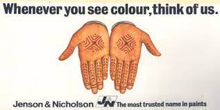
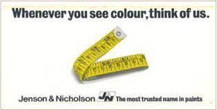
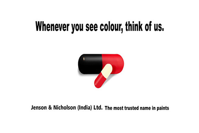
And the first visual was a fried egg…..
The campaign won numerous awards
And also created a huge amount of recall for the brand
This is perhaps one of the earliest & finest examples of a billboard driven branding campaign.
The Laborious Task Of Painting Hoardings
40 creatives were rotated through 300 sites in India’s main cities. At regular intervals, the creatives had to change. And then each hoarding then had to be hand-painted. The contractor had to send the pictorial proof of the completed hoarding along with a daily newspaper photographed with it.
A TVC was also created even though very few TV owners across the country which was a very bold step at that time.
Podcasts
https://portfolio.mentza.com/portfolio/vejayanand/circles/20496


Hi
I’m not sure if you will ever get to see this, but I am trying to track down one of the ads that was used in the series…it had 6 or 7 babies of different ethnicities and the line “do not open their eyes to differences they cannot see” – probably the most topical theme for our times…
I know it was some 40 years ago, but if you have an image, could you send it through please. My dad used to work for J&N in the day and this was the billboard that most resonated with me.
Steve
Hey Steve, unfortunately, a lot of the ads have disappeared. J&N itself has tied up with Sheenlac. As you said, the ad you mentioned is so topical.