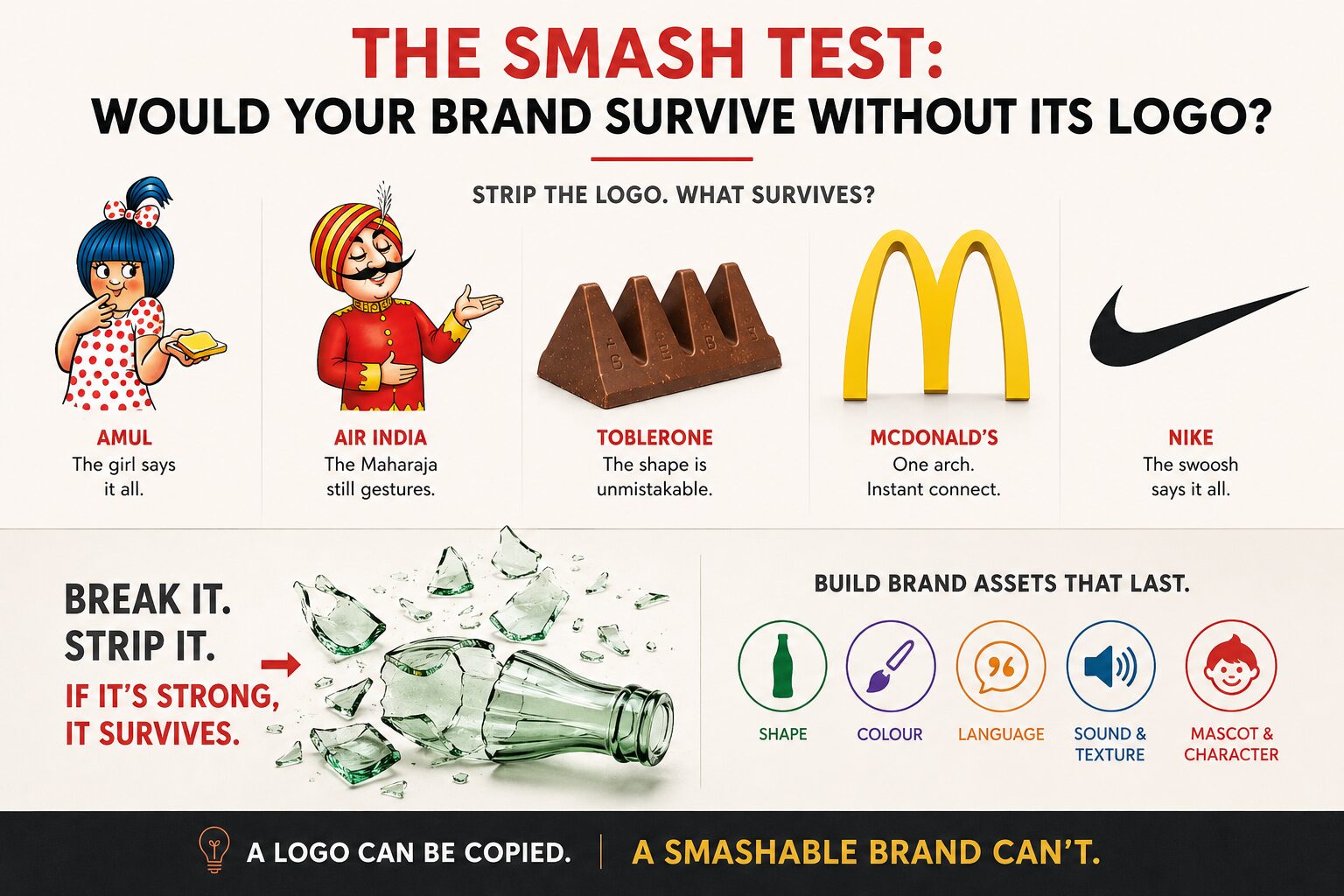
The Smash Test: Would Your Brand Survive Without Its Logo?
Most brands collapse without their logo. Learn the “smash test” with Amul, Cadbury, Coca-Cola and global examples to build a truly ownable identity.
In 1915, Root Glass Company designed a Coca-Cola bottle meant to be recognised in the dark and identifiable even in shards. The brief was unusual: make a shape that survives breaking. Inspired by the cocoa pod, the designer gave it ridged contours. Eight decades on, that bottle is still instantly recognisable, logo or no logo.
This is called the Smash Test, conceived by Martin Lindstrom. Strip the logo off your brand. Remove the name. What survives?
Most brands would fail this test today. Take away the wordmark, and you’re often left with nothing distinctive: generic packaging, borrowed colour palettes, and interchangeable typefaces. The brand collapses the moment the name disappears.
A few don’t:
- Break an Amul butter wrapper into pieces, and the mascot girl in the polka-dot dress still says Amul.
- Remove every word from an Air India advertisement, and the Maharaja still gestures unmistakably.
- Strip the label off a Nirma packet from the eighties, and the colour block alone did the talking for a generation.
- Silhouette a Toblerone bar, and the triangular peaks read instantly; no name required.
- Cut a McDonald’s sign down to just the arch, and the brand still announces itself from a highway.
- Show the Nike swoosh on a shoe with the wordmark masked off, and there’ll be no ambiguity left anywhere in the world.


These are brands that have built equity beyond the logotype.
Logo dependency is a design failure, not a strategy
Founders chase a striking logo and stop there. That’s backwards. A logo is one signal among many: colour, shape, sound, language, texture, and navigation. Treat it as the only signal, and you’ve built a fragile brand, one that depends entirely on the name being visible and legible.
Consider the constraints brands actually operate under, in India and globally:
- A roadside hoarding in Tier 2 India gets three seconds of attention from a moving vehicle.
- A WhatsApp forward compresses your pack shot into a thumbnail.
- A counterfeit product on a Sivakasi shelf wants nothing more than your logo to copy, because that’s usually all there is to copy.
- A 280-character tweet or a six-second pre-roll ad leaves no room for a name, only for an instantly readable cue.
If your brand identity lives entirely in the wordmark, you’ve handed duplication a blueprint.
Building the smashable brand: an audit
Run this exercise on your own brand, piece by piece.
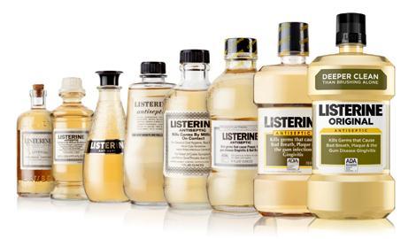
- Shape. Does your product have a silhouette people would recognise, blacked out? The Bisleri bottle taper, the Parle-G wax paper fold, and the Maggi noodle cake shape are owned forms, not accidents. Globally, the Absolut Vodka bottle has carried entire ad campaigns on shape alone since 1981, and Chanel No. 5’s flacon is recognisable in outline on a perfume counter from across the room.
- Colour. Cadbury’s purple is litigated property at this point, much like Tiffany’s particular shade of robin’s-egg blue is legally protected in the US. Vodafone’s red doesn’t need the brand name beside it on a billboard. If your category colour is the same as your competitor’s, you haven’t built a colour asset; you’ve borrowed one.
- Language. Has your brand created words people use unprompted? “Daag accha hai” did more equity-building for Surf Excel than any logo placement that year. Zomato’s tone of voice in customer replies became more recognisable than its app icon for a stretch. Globally, “Just Do It” functions independently of the swoosh, and “I’m Lovin’ It” needs no golden arches beside it to land. Ask: If I deleted your brand name from your last ten Instagram captions, would readers still know it was you talking?
- Sound and texture. The Nokia tune, the Intel chime, and the specific crinkle of a Lay’s packet: these register before the eye ever finds a logo. The Netflix “ta-dum” and the THX startup boom do the same job in cinema and streaming contexts worldwide. Most Indian D2C brands ignore sound entirely, leaving this asset on the table.
- Mascot and character. Amul’s girl, the Fevicol elephant ad universe, and Air India’s Maharaja: India has produced some of the world’s most durable brand characters, often outliving the campaigns that introduced them. The Michelin Man and Mr Peanut have done the equivalent job globally for over a century each.
Why this matters more in cluttered markets, not less
India is among the most cluttered media markets on earth, but the pattern repeats globally wherever screen time outpaces attention span. Between OTT pre-rolls, festival-season sales banners, influencer unboxing videos, and outdoor hoardings stacked three deep on a flyover, a consumer’s filtering instinct is sharper here than almost anywhere else. A name alone, however well-designed, gets filtered out with everything else.
Co-branding adds another layer:
- Bank-and-fintech tie-ups
- Cricket-and-FMCG sponsorships
- Quick-commerce-and-D2C placements
- Sneaker-and-fashion-house collaborations, the kind Nike and Off-White or Adidas and Gucci have run globally
When two brands share thirty seconds of a reel, two logos side by side are not a strategy; it’s a compromise. The brand that has built shape, colour, and language equity survives that crowding. The one that hasn’t disappeared into the other brand’s gravity.
The takeaway
Stop auditing your brand by its logo file. Audit it by what remains when the logo file is deleted. If the honest answer is “not much”, that’s not a design problem to hand to an agency: it’s a strategic gap in how the brand has been built.
- Own a shape.
- Own a colour.
- Own a phrase.
- Own a sound, if you can.
A logo is replaceable in a rebrand. A genuinely smashable brand identity is not.