Iconic Ads: Volkswagen – Think Small

The path breaking campaign by DDB for Volkswagen started when it was launched in the 60s, and for many years after that.
Following WWII, restrictions governing German exports were loosened, and Volkswagen began to sell across Europe in the 1950s. It was becoming popular. Volkswagen was selling in the United States too, through word of mouth, to people who weren’t convinced by the sleek and costly options from the existing brands.
The big brands noticed that in the late 50s, Volkswagens had sold 100,000 numbers. They then planned their small car. To pre-empt this, Volkswagen dispatched Carl Hahn to the United States. His main job was to promote Volkswagen.
Selection Of Agency
Carl Hahn was becoming more dissatisfied with several agencies. Automobile advertising, at that time, aimed to provide the reader with as much information as possible rather than persuade them to buy a product. They were based more on imagination rather than fact.
Most of the ads that agencies showed Haan had a typical formula, such as an image of the automobile on a lovely driveway with a pleasant family admiringly around it.
He was directed to DDB and was to receive a pitch from Bill Bernbach. Bernbach did not do so. The reason for this was because he was unfamiliar with the product.
Instead, he walked Hahn through DDB’s previous work. Bernbach’s honesty was what struck Hahn the most. And he discovered an agency that could handle Volkswagen’s advertising.
Budgets were quite limited. Volkswagen’s advertising budget was $600,000, compared to $30.4 million for Chevrolet alone and $25 million for Ford.
The DDB crew then paid a visit to the factory in Germany. Bernbach was blown away by what he witnessed, particularly the workers’ pride in their job. He told Helmut Krone, his colleague, that this was an “honest car.”
For a local Volkswagen dealer, DDB was already advertising. Krone was assigned the main account because of this. He was also the owner of a Volkswagen.
Julian Koenig, Krone’s copy partner, was a Jewish man who wasn’t concerned by Nazi ties. After a brief career in the US Army and running a small baseball team, Koenig became a copywriter.
The Layouts
Working with Helmut Krone was reportedly difficult. Krone was dissatisfied with Bernbach’s Honest Approach. Initially, he wanted to show the automobile in the same manner that the other agencies had envisioned it: as American as possible. Krone was also uneasy about the prospect of selling “the Führer’s car.”
Anyway, they started to work and presented the first round of ideas/layouts. The VW advertising manager Helmut Schmitz spotted a small phrase in Koenig’s copy – “maybe we got so big because we thought small”. Schmitz drew attention to the phrase “think small” and stated that it should be the headline. Koenig was happy with this; his initial headline had been “Think Small,” but Krone had persuaded him to change it to “Willkommen.”
Krone was displeased, but Bernbach intervened, resulting in new layouts. In classic Krone fashion, he chose a standard ad layout with an unconventional image for fine tweaking.
The conventional format in advertising was a headline with 3 columns which Krone referred to as The Ogilvy Layout disparagingly. He thought Ogilvy was inferior.
Krone could take something familiar and tweak it just enough to turn it into something fresh. He used Futura sans-serif typeface for the heading and body text, unlike serif that was used. Widows and orphans were in aplenty. Krone used a razor blade to cut them in the original ad since he was looking for a stopping and natural effect. He even told Koenig that he should write the text in this manner. The peculiar typesetting added to the lines which Koenig wrote. He put a full stop after the headline. This forced the reader to stop. Eventually, this became Krone’s signature.

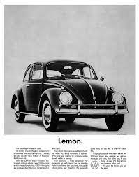
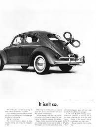
The Volkswagen logo was oddly positioned between the second and third columns. Krone despised logos in his advertisements. However, the placement of the Volkswagen logo in an unexpected location ensured that this was not a typical advertisement. Krone chose to use a picture of the car rather than a beautiful image like everyone else. It was at the upper left corner, at an angle, and in the middle of the white space. This was to show simplicity.
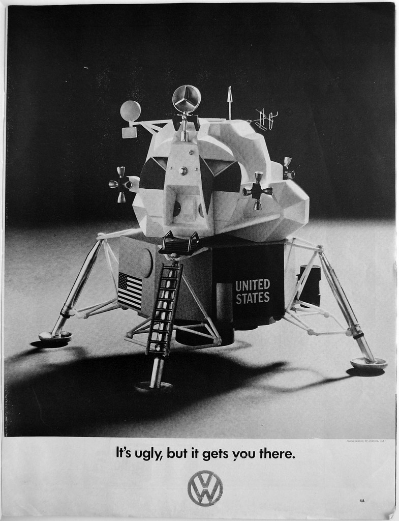
Because Volkswagen didn’t have enough money to print it in colour, the entire ad was produced in black and white. This was in contrast to all other advertising which was in colour and hence these ads stood out.
And surprisingly, Krone hated the ads he created and left the country when it was released.
The public, however, loved it. The ads became posters for many.
The Impact
In 1959, Julian Koenig left DDB to start his agency, and Helmut Krone teamed up with Bob Levenson. The Think Small ads were rewritten by Levenson and released in 1960 with a few creative modifications by Krone. A new approach to advertising was provided by Levenson. The copy had to be both aesthetically appealing and convey a captivating tale in a self-deprecating and clever manner.
For a long time, Volkswagen advertisements were based on Krone’s original layouts.
The Think Small campaign was a paradigm change that reflected a societal transformation. Because the copy did not talk down to anyone, the customers were assumed to be intelligent enough to figure things out. Suddenly, an advertisement appeared that appealed to people’s brains in a manner that previous style-based ads had not.
.
The advertising touched on a sense of disconnection among the general public as a result of years of being driven to purchase and consume especially the younger lot. Those born after WWII were raised by parents who pushed them to purchase and consume their way to happiness, which they refused (to a large degree). The Think Small ad was launched just as this voice was beginning to gain traction, and it would continue to do so throughout the 1960s. The Volkswagen Beetle became an important element of American counterculture, thanks in large part to the very effective advertising produced by DDB.
For more reading & information:
- https://vimeo.com/177880740
- https://medium.com/theagency/the-ad-that-changed-advertising-18291a67488c
- https://hip.agency/the-advertising-campaign-to-remember/


1 Comment