Iconic Ads: 99% Fun 1% Land – Mauritius Tourism
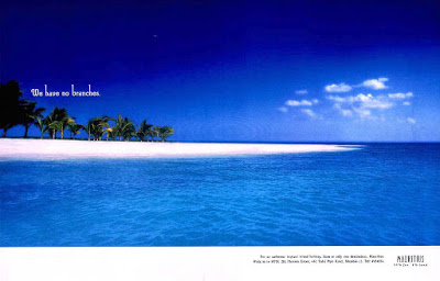
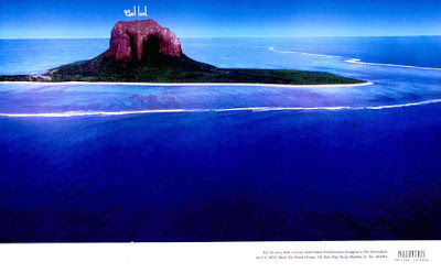
In the early 90s, Mauritius was looking to give a boost to tourism. India was one of their key target markets. They wanted to show that Mauritius had more to offer than just beaches – cuisines, sport, flora, fauna etc.
A simple brief to Trikaya Grey resulted in one of the most memorable print campaigns. Copy by Alok Nanda and art by Vikas Gaitonde followed by Kanad Banerjee with photography by Prabuddha Dasgupta.
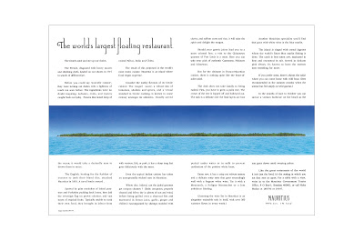
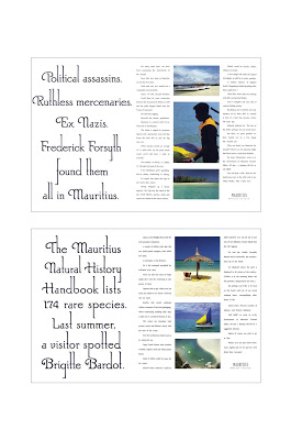
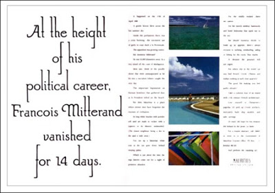
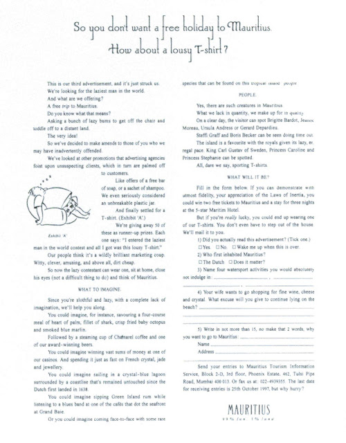
A unique feature of the campaign was the selection of typography. The headlines had interesting long extensions for the letters – ‘l’ ‘g’ ‘h’ etc. This unique font was created by Vikas Gaitonde to reflect the laws of Mauritius. The rule was that no man-made structure could be taller than a fully grown coconut tree. The uniqueness of the typography was that nobody else could use the font without being accused of plagiarism.
Freddy Birdy aptly sums up, “When you read ads like that Mauritius Tourism, they make you want to pack your bags and go there.”
The campaign was so successful that it was adapted into other languages too.
It was also the first campaign from India that made it to the prestigious One Show.