Brandless & Branded- No Name
No Name created a brand without being one. In a market with multiple private label brands, No Name carved a space for itself
It was a difficult time for the Canadian economy in the 1970s. With such significant inflation, consumers were forced to spend a larger portion of their income on essentials like food than they had been in previous years. Then Canadians spent 21% of their income on food. Today, that is somewhere around 10%.
Dave Nichol, a consultant from McKinsey & Co., was sent to Loblaws as a result of a rapidly deteriorating scenario. After a few years, he was hired to lead operations. Initially, Nichol managed the business as usual, but he soon became dissatisfied with the outcomes. As a result, he turned to European merchants, particularly Marks & Spencer in England.
Marks & Spencer was known for offering high quality, British-made apparel and household goods. The majority of these items were under the “St Michael” private label. They were able to engage directly with manufacturers to develop superior quality items at a reduced cost to consumers as a result of this arrangement. At the time the cautious corporation had yet to grow outside of Great Britain. Nichol also looked at French and German grocery companies that developed their own generic brands in the 1970s, but his emphasis on quality came from the English.
The No Name Range
Nichol and Loblaws introduced the 16-product line of No Name brand items in 1978, which included coffee, staples, laundry detergent etc. Along with it, the first No Frills store was opened in Toronto
In addition to national brand-name pricing, customers could choose from the lowest priced generic pricing range or the most affordable store-brand pricing range. The launch of the brand and its steep discounts were widely covered by the media. As a result, Loblaws was able to gain ground over competitors like Dominion, who were also focusing on their own range. Incidentally, No Name beat Dominion by 24 hours for the launch.
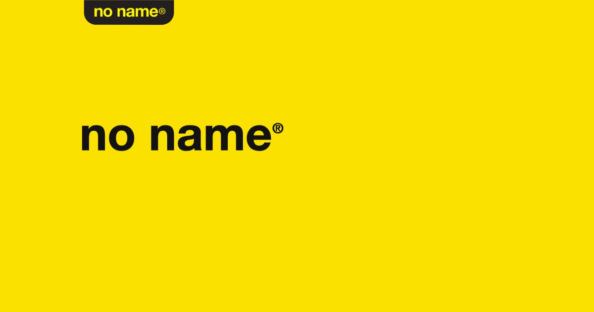
The No Name look is a distinctive yellow packaging and concise, black-on-black Helvetica typography. Don Watt, a famed Canadian graphic designer, was engaged by Galen Weston Sr. in 1973 to resuscitate Loblaw, which was floundering at the time. No Name’s look was created by him.
So…….
Beer is beer.
Cola is cola.
Fabric Cleaner is Fabric Cleaner.
Chilli Sauce is Chilli Sauce
Ketchup is…….Got the idea?.
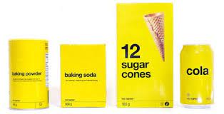

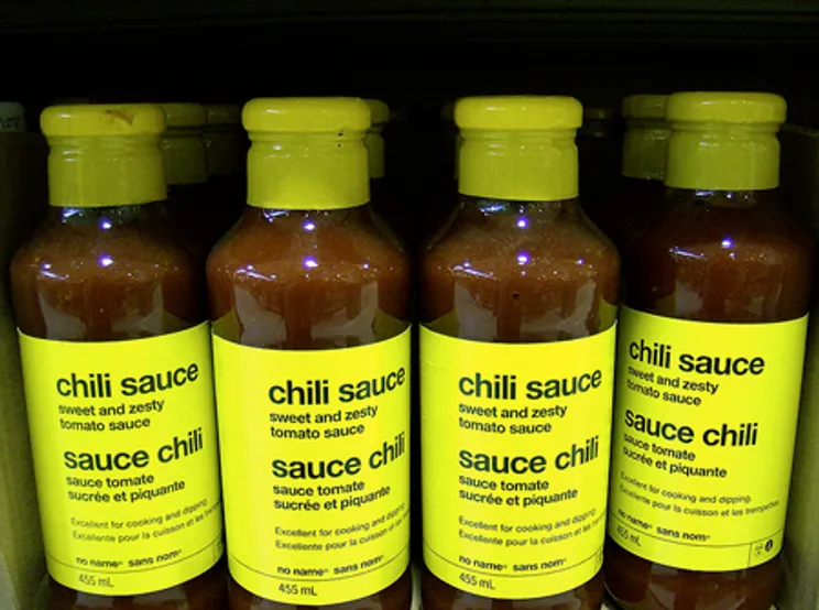
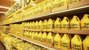
Also, the typeface does not change. Along with the very specific brandless names, the packaging doesn’t change colour.
The brand is not a brand, but it is one with a dash of humour
All private label brands package & communicate in a certain way that is similar. While No Name is also similar, it zagged when others zigged. They removed all the fancy stuff and left themselves threadbare.
There is more
The website says “website”.
The Twitter page says “Twitter page”.
This “anti-brand” approach has given the brand cult-like status.
The product portfolio has grown from 16 to 2,900 items since 1978. On Twitter, a simple photo of biscuits receives 6,000 likes. Special merchandise is demanded by customers and gets sold out immediately
What is so different with No Name?
- Zig when others Zag – the crux of a brand is to being different and occupying a space which is not occupied by other. No Name does it by its sheer starkness
- Kept it simple – There is a lot of beauty in simplicity. And keeping it simple is very tough. No Name has removed all the pizzaz associated with brands. But therein lies the strength of the brand. It has removed all unnecessary accrouments.
- Keep it consistent – The brand has been consistent over the years – packaging, communication, aesthetics etc. Being consistent over such a long period is indeed a big challenge. Consistent tone, Consistent aesthetics. Consistent messaging.