Tropicana’s Packaging Redesign – A $50 Million Failure
Even if your idea is the best ever, it won’t generate income if it doesn’t resonate with your target market.
One of the most intriguing package redesigns is the 2009 makeover failure of Tropicana.
Background
Tropicana used to be owned by PepsiCo, and the company decided to change its name and put its best-selling orange juice in new packaging.
When promoting their new fruit juice packaging, Tropicana spent $35 million on an advertising campaign. Arnell, the same company responsible for the product’s packaging design, also developed the advertising.
For its best-selling product in North America, Tropicana Pure Premium, which generated annual sales of more than $700.0 million, the company unveiled its new packaging in January 2009. After a few days, customers began complaining about the new look, mostly on social media. Customer dissatisfaction was so high that there was a 20% decline in sales in two months and a loss of $30 million was incurred. Rivals were able to capitalise on the situation.
In February 2009, Tropicana went back to its original packaging. Tropicana spent more than $50 million on this initiative.
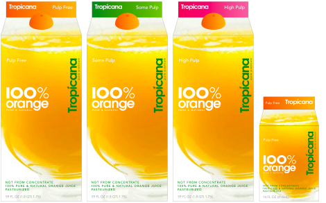
The original and the new

The plan was to take the brand and change it into something more modern.
The most notable difference was that the orange and straw had been replaced with a large, clear glass full of orange juice.
The Tropicana orange packaging only displayed the fruit’s peel. Interestingly, the product “the juice” was never shown.
- The lid:

The company opted to transfer the orange to the bottle’s crown. The concept is ingenious and intriguing; the cap looks and feels like half an orange, making it ideal for squeezing out orange juice. The slogan “Squeeze, it’s natural” is on both the packaging and the ad for the product, which came out at the same time.
- The logo:
The updated logo is another major distinction between the two sets. Whereas the old logo was horizontal and had the words “Pure Premium” underneath it, the new one is vertical and uses a cleaner, more contemporary typeface. The logo was shrunk to put more emphasis on the tagline “100% Orange Pure and Natural.”
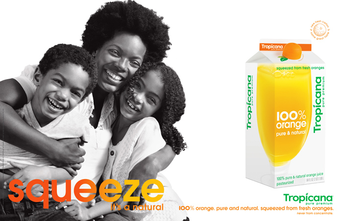
The advertising push that coincided
Both the new packaging and advertising for Tropicana have been unveiled together. “Squeeze, it’s a natural,” was the campaign’s catchphrase.
The goal of the “squeeze” campaign was to capitalise on the positive associations consumers have with the Tropicana brand while also highlighting the nutritional value of orange juice as a source of daily fruit intake.
Learn from the customers’ mistakes
- Adoption of the brand on an emotional level
Tropicana failed to account for the customers’ strong sentimental attachment to the older packaging. People would feel so strongly about a product just because its packaging was lost on them.
- Packaging’s influence on consumer choice: The issue extends beyond the emotional ties that the previous packaging held with its target audience.
- Giving package design some thought is crucial for branding and its connection to merchandising. There was confusion among shoppers who saw this item on store shelves. When they spotted “100% Orange Juice,” several regular buyers wondered whether it was still the same reliable Tropical Pure Premium they’d come to know and love. As a result, customers started having trouble recognising the goods since they had lost their primary identifiers. Here are some of them:
- Instead of emphasising “Pure Premium,” the emphasis is on “100% Orange.”
- The new layout’s aesthetic: customers complained that the new packaging looked like it came from a cheap supermarket brand and called it “ugly” because of its simplified appearance compared to the original. People were confused by this new design because Tropicana used to be seen as a high-end brand. This new design made the brand look cheap.
Understanding what we’ve learned
- A strong connection on an emotional level
Loyal customers develop an aesthetic attachment to their favourite products and brands.
When consumers no longer recognise familiar parts of the container design for a brand they have developed an emotional attachment to, they may feel cheated and dissatisfied. It is crucial to keep this in mind at all times before making any modifications to package designs.
- All of the packaging’s branding aspects can’t be updated at once.
The company’s attempt to update the Tropicana brand ran afoul of one of the cardinal laws of branding: maintaining easy product recognition.
Tropicana muddled its brand’s consistency by switching out too many features at once. Because of this, customers weren’t sure when they should buy orange juice.
Make gradual changes if you are redesigning the packaging for your product. Consumers need time to adjust to the new branding before they abandon it.
This is only relevant for well-established brands like Tropicana. A complete rebranding might be an effective strategy for keeping the product on shelves when a company’s name and product aren’t resonating with consumers. Indeed, there have been several instances when a change in packaging was the primary factor in increased sales.
- Product packaging acts as a hidden salesperson.
Brands’ last chance to influence customers’ final purchase choices is via their packaging. The brand’s fate depends on the aesthetic and editorial quality of this piece since it will sway the final purchase decision of the customer. Customers were unfamiliar with and unimpressed with Tropicana’s revamped packaging, so they opted not to buy the new products.
Packaging design and advertising follow separate sets of standards for conveying messages.
Businesses may better convey feelings and promote novel ideals with the help of advertising. Information and long-lasting emotions are what advertising is all about. In the long run, this interaction will prove to be more adaptable than others.
When a customer is making a final choice about what to buy, the company’s package design should be more precise, more noticeable, and easy to understand.
Conclusion
The success of Tropicana’s rebranding campaign demonstrates the tremendous influence of packaging. Even though this particular instance revealed the wrong side, it’s crucial to remember that it’s also often put to good use.
Marketers and brand strategists may learn from this to value packaging design more and work harder to use this brand asset in a planned way. This will guarantee that customers welcome the shift!

1 Comment