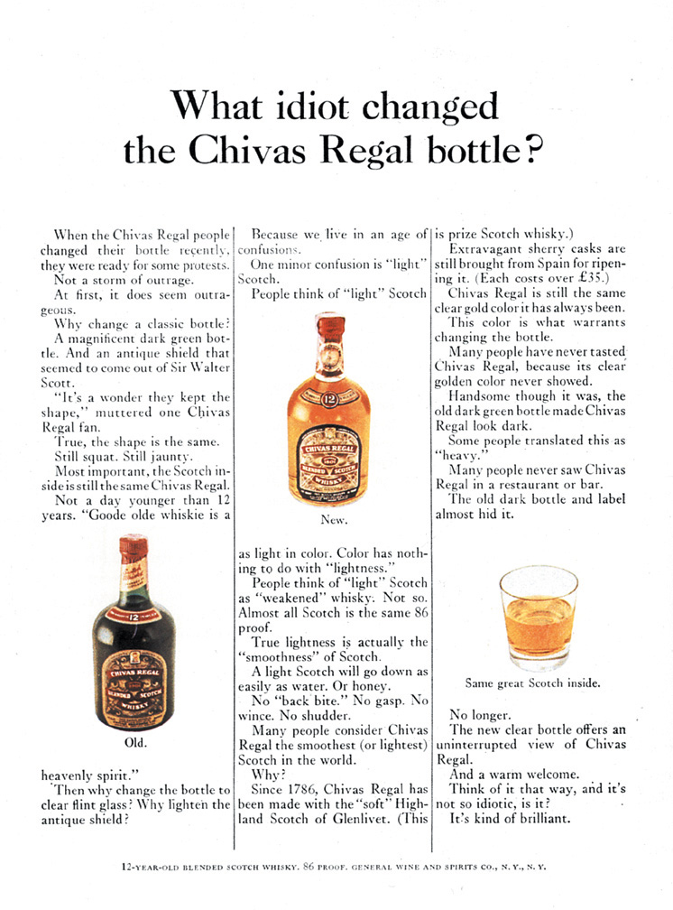
Iconic Ad: Chivas Regal—What Idiot..

Seemingly disapproving, despite appearances to the contrary, the product is just as excellent as it has always been.
Lighter scotches like Cutty Sark and J&B Rare started to eat into the brand’s market share in the 1960s. To reverse the sales slump, Edgar Bronfman persuaded his father that adjustments were necessary. Redesigning the product’s formula, packaging, and advertising all fell under this category.
Then Bill Bernbach.
During their first encounters, Bill Bernbach informed Sam Bronfman, owner of Chivas Regal, that Bronfman knew more about the business than Bernbach would ever know since he created, breathed, and dreamed it. But Bernbach knew his business better, even if it involved Bronfman’s brands.
‘You mean, together, we can do a great job? OK, you’ve got the account,’’ Bronfman replied.
By clearly defining roles and responsibilities, DDB transformed Chivas Regal into a premium brand and propelled it to the top of its category.
To bring out the magnificent tawny-amber hue of Chivas Regal, the bottle’s material changed from dark green to transparent glass.
A copywriter working on the Chivas Regal account voiced a dislike for it.
“What idiot changed the Chivas Regal bottle?” Bernbach shouted, “That’s the headline!”
In a meeting, Bernbach supposedly kept concealing that one ad from Edgar when he showed him the new advertising, and that one was at the very bottom of the stack. Bernbach was unwilling to reveal it to Bronfman because he was worried Edgar wouldn’t dare publish the advertisement.
The headline read, “What Idiot Changed the Chivas Regal Bottle?”
To cut a long tale short, Bronfman was smart to see the value in the ad’s brazenness and self-deprecating tone, and the ad was published.

The ad’s title is catchy since it’s funny and direct, which draws in customers. People would likely pause what they’re doing to read this ad if they encountered it while perusing a magazine. Despite its seemingly uninteresting appearance, the body content provides readers with a wealth of information. In this scenario, it clarifies things for prospective consumers. It conveys a powerful message: the product’s contents are unaltered despite the visual alteration.
In this advertisement, Bernbach’s strategy focuses on how unique the brand is. Here, he’s attempting to stress that, despite appearances to the contrary, the product is just as excellent as it has always been. At first glance, Bernbach seems to be disapproving of the new Scotch bottle design, but he supports the change and promotes the product, proving the headline wrong. He is making an effort to clarify that the bottle change enhances Chivas Regal. Bernbach also included product-related remarks that devoted customers could recognise, as branding is a big part of advertising. Consequently, despite the product’s outward transformation, customers can grasp it a little better.
The statement appears harsh at first glance, but it’s what drew people in. Bill Bernbach makes the lengthy body material simple to read by combining factual information with a nice sense of humour.


