Branding a Country: Brand Peru

“Branding” a nation is to raise the demand for the country’s products and services, which in turn attracts more visitors & investors.
Successful branding may also aid in gaining more positive international recognition for the country.
Peru has been using its new brand identity since 2011. Since 2009, the Peru Exports and Tourism Promotion Commission (PromPeru) has been in charge of the brand’s development, while the Buenos Aires office of Futurebrand has been in charge of its visual identity.
Opportunity
A powerful and positive national brand that captured people’s imaginations and communicated the country’s values and potential was essential for Peru to be noticed.
The goal was to give the country an edge in the global market, not only to boost exports and tourism but also to attract potential investors.
The Strategy
The new brand’s look and feel were inspired by Peru’s vibrant culture and history.
It was created to showcase everything wonderful about the new and contemporary Peru-its exquisiteness and diversity
- Identity
The agency recognised that the brand would be used in many different contexts (tourism, investments, etc.) and so opted for simplicity. It centred on the single word “Peru,” with no embellishments.
- The Shape
The treatment is entirely typographic, including a capital P with a spiralling design that recalls a visual element seen in many of Peru’s many ancient cultures and archaeological sites like Moray and Caral.
The symbol stands for development, progress, and transformation. Symbolic of the idea that “There is a Peru for everyone,” it also looks like a fingerprint.
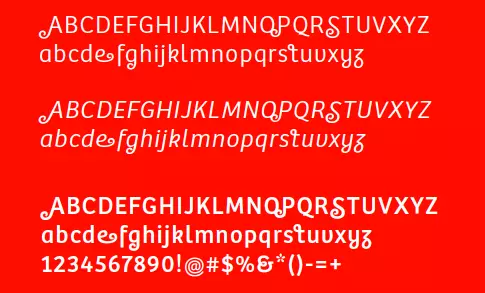
Type Together, a company that specialises in designing typefaces, designed the new font Bree Peru, used for the logo. The new design has a spiral squiggle at the end of several capital letters to match the round shape of the letter P and the patterns from the old civilization.
- The colour red
The red colour of the logo was chosen to match the bright red of the Peruvian flag, which represents the lively culture and people of the country.
The brand identity was based on using a multi-coloured palette rather than simply red because of the many features and qualities that make up the nation. The vibrant hues represent the variety of Peru’s landscapes and cultures, as well as the country’s lively and inspiring spirit.

- The design
The many geographical settings and cultural traditions served as sources of ideas for the graphic design line.
The pictures used for the promotional campaign are classic representations of Peru, with the addition of curving lines that trace the shapes of prominent features. This layout unites the photos with the feel of the campaign as a whole and distinguishes them from the generic stock photos that are usually used for travel businesses.
Outcomes
The final product is a sign that is instantly recognisable across the world and that encompasses all of Peru’s rich history, culture, and traditions. It won a D&AD ‘in book’ award in 2012 for the identification system’s design.
This new and distinct identity for Peru showcases the country’s many cultural offerings to the globe. The brand’s approach reflects a genuine link between the brand and the country