Iconic Ads: Wonderbra – Hello Boys
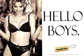
The use of sexuality, physicality and a tongue in cheek phrase “Hello Boys’ aesthetically created a mindspace for Wonderbra.
It was 1993. Holmes, Knight, Ritchie/TBWA had hired Nigel Rose, formerly of Collett, Dickenson, Pearce and Partners, as a joint creative director. He arrived at an unfortunate time. Playtex, one of the most major accounts, moved to Saatchi & Saatchi. Nigel was a fashion expert. He won awards at CDP for his efforts on the Mary Quant and Clark’s accounts. How could Nigel, despite his considerable fashion understanding, win an account that had already left.
Susanna Hailstone account director on Playtex had other ideas. Encouraged by Nigel’s arrival at the firm, proposed that if she had some work to show the client, at least one of the Playtex brands, Wonderbra, could be saved. Nigel agreed to help but he was handicapped by the fact that Murray Partridge, the writer he was to work with, had recently become ill and was on sick leave. So Nigel shut himself away in his office for a fortnight, to come up with new ideas. Nigel had 15 fully formed poster concepts by the end of two weeks, including the lines, the aesthetic, and everything else.
The weaker concepts were weeded out, leaving just the strongest. ‘Hello, Boys’ was the poster that got everyone’s attention. But what did Nigel think? Nigel says “ A scene from Mel Brooks’ film “The Producers” was playing in the back of my head. A beautiful Swedish secretary is jammed between the film’s leading men, Zero Mostel and Gene Wilder, in this scene. ‘Hello Boys,’ Zero remarks as an aside while gazing affectionately at the secretary’s breasts.
In reality, Nigel had misremembered everything. The ‘Hello Boys’ phrase is in a different setting. In the movie, Max Bialystok, played by Zero Mostel, glances into a safe full of banknotes gained by overselling shares in ‘Springtime for Hitler,’ a musical that was cancelled after its first night. When Zero sees the money, he says the sentence.
So two seemingly conflicting ideas combined to produce a satisfying whole. Nigel may have forgotten things, but the end result was a Good headline, ‘Hello Boys’.
Susanna set up a meeting in a hotel and exhibited the work to the client. The client was so taken aback by what she saw that she agreed to let TBWA keep the Wonderbra brand. “All Saatchi and Saatchi has shown us so far are documents,” she remarked, “but you’ve shown us a viable campaign.”
Now Nigel had to put it together. He chose black and white photos over colour for the posters to give them “more edge and sophistication,” as he puts it. He wanted German fashion photographer Ellen Von Unwerth to shoot. She was working in Paris at the time, so Nigel took the Eurostar and met her for lunch at the Terminus Nord restaurant, directly across from the Gare du Nord, to get her opinion. Ellen was enthusiastic about the project, and he soon found himself in Paris, watching Ellen photograph Kerry Clausen, an American model, in the bra. The shots were spectacular. There was only one little snag. Nigel had to reshoot since the client’s fitter had miscalculated the bra size.
Kerry Clausen couldn’t come since Ellen Von Unwerth was in New York. So the model had to be recast. So Susanna Hailstone went to Ellen Von Unwerth’s casting session in New York. Kerry’s place was taken by Czech model Eva Herzigová. Eva had previously been in a trendy Guess? Jeans advertisement and had the perfect personality, appearance, and breasts for the shoot.
Nigel then flew to New York for the shoot. Ellen Von Unwerth and the Royalton Hotel’s penthouse suite, where the shoot was to take place, were both hired for two days.
Nigel recalls Eva taking a break from shooting and going out on the balcony in her pantie. Hundreds of men’s faces appeared across the street. When Eva spotted this, she posed in front of the windows for passers-by before returning inside. The shoot proceeded smoothly. Ellen sent more beautiful images, this time in a bra that fit her well.

Nigel returned to London and began work on the ‘Hello Boys’ poster. To make the most of the two-word headline, he used his favourite typeface, Felix. He also wanted a four-colour black and white poster rather than a single black plate to give the photo additional depth. It was merely the Wonderbra emblem, tucked under a small yellow clothes tag with the accompanying slogan, ‘The one and only Wonderbra’ which came in colour
Perhaps its highest honour came from Birmingham City Council, which ordered the poster removed from public spaces in the city — not because it was unsightly or offensive, but because it was distracting drivers and was responsible for a string of vehicle accidents. You have to wonder if it was the kind of impact Nigel had in mind when he sat down to make an impressive poster. Most likely not.


