The GAP Logo Redesign – A Botched Attempt

Observing the backlash that the makeover has received in the may be terrifying for a marketer, but it also offers an opportunity to learn.
In 1969, the world’s first Gap store opened. Due to its widespread appeal, it became one of the world’s biggest speciality stores.
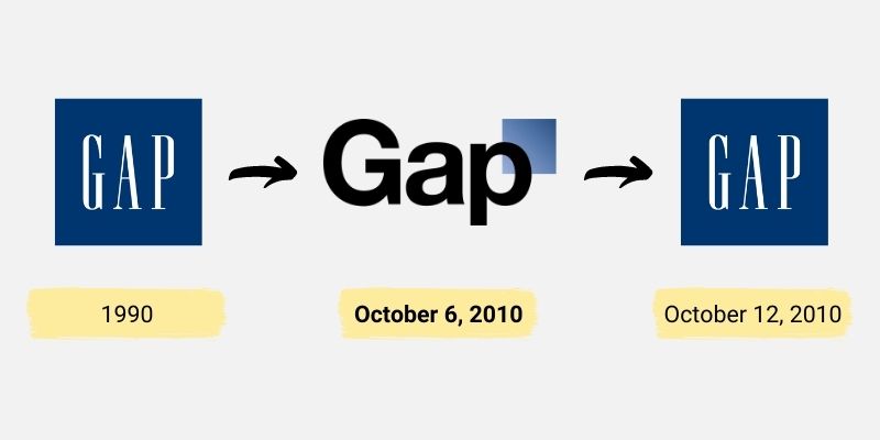
Gap redesigned a 20-year-old logo in 2010 in response to falling sales after the 2008 financial crisis.
Logo used from 1990 to 2010 by Gap

The dark blue square with the white serif font spelling out “Gap” is an instantly identifiable symbol of the Gap brand that was in use from 1990 to 2010. When a company’s strategy changes in a big way, the brand may get a new look to show that things are changing. As a result, the 2010 near-total overhaul of the original logo surprised many people.
Overnight, the old Gap logo vanished. As of October 6, 2010, a new logo was introduced, featuring a considerably smaller dark blue box with the ‘Gap’ name printed in strong, black Helvetica type.
Gap’s longtime creative partners, Trey Laird and Laird and Partners, worked closely with Gap of North America president Marka Hansen on the new logo. Roughly $100 million was spent on it.
Gap had been undergoing some changes. It was only logical to consider the logo’s future after it had been in use for almost two decades.
The logo was introduced “without much ceremony” to kick off the discussion.
Gap wanted to give a modern look – a sign of times. The sole throwback feature was the inclusion of a blue box. The company’s aim in redesigning its logo was to show that it has moved on from “traditional American design” to “contemporary, sexy, and stylish.”
For what it’s worth, Gap appears to be on a quest to take the firm, and its sales and stock price, higher. Same-store sales were down 4% at the time, having dropped 10% the year before, and this desire to modernise was viewed as a “rush to do something, and rapidly,” in an attempt to reverse the declining sales.
It was also widely agreed that after 20 years of using the same logo, Gap was suffering from brand weariness or fatigue and that the makeover was done to bring in a change.
Did the New Gap Logo Last Long?
On October 12, 2010, they brought back the old logo.
Within a week of unveiling its new logo, Gap decided to go back to the one it had used in 1990. This was an embarrassingly quick change. The same spokesman, who had before described the company’s logo as “contemporary, sexy, and stylish,” now said, “we’ve discovered just how much energy there is surrounding our brand, and after much deliberation, we’ve chosen to go back to our classic blue box logo.”
The quick switch back to the old Gap logo shows how bad the rebranding effort was. Consumers and industry experts were both surprised by the sudden change to the logo, and almost everyone said they didn’t like it. Before the move, neither the company’s products nor its upper management team had changed in a noticeable way.
Instantaneous Consumer Pushback
Customers who didn’t like the company’s new logo didn’t waste any time complaining about it on social media. The new logo was met with mixed reviews; some praised it for reflecting the brand’s inherent qualities (which are straightforward and functional), while others were less enthusiastic.
A “Make your own Gap logo” site became popular in less than a day, amassing almost 14,000 parody logo redesigns, and one online blog received 2,000 nasty comments.
Since Gap changed their image on their own, it’s clear that both customers and branding experts felt tricked. The public was both perplexed and outraged by the sudden shift in appearance.
Recognizing the Pushback
To what end, therefore, did the new Gap logo strike such a nerve with the public?
- Brand Awareness
Logos are a powerful symbol used by consumers to identify a certain brand; they are often the first thing that comes to mind when someone mentions a particular company. Consequently, the logo plays a significant role in establishing brand recognition. Changing your logo often may be confusing for consumers and might damage your brand’s reputation if done without careful planning. Will your clientele recognise you as the same company they’ve trusted for years?
- Emotional Bonds
Brands, even devoted ones, sometimes fail to appreciate the depth of the emotional connection they have with their customers. Because a brand name and logo make people feel like they know and can trust the product, they form a strong emotional connection.
A logo is a visual sign of trustworthiness and a connecting point between the brand and the customer, since the latter already knows what to expect from the former. The same reasoning holds true in human interactions: we are more likely to feel comfortable and trusting of others if they have a face we are familiar with.
The Gap’s Botched Logo Response
- To begin, an effort to redesign using crowdsourcing
Gap’s first defence of its new logo was that it was part of a plan to find out what the public thought about a new look. Gap thanked their Facebook followers for their feedback on the company’s new logo with the post, “Thanks for everyone’s input on the new logo!” […] We’re aware of the hype that has been generated by this logo, and we’re excited to see heated discussions taking place. This is why we want to see your artwork. Yes, our version is fantastic, but we’re open to others.
It’s possible that the new logo was just a marketing ploy to get people to recognize the brand and buy more products through social media and user-generated content. Since the designers (Laird and Partners) are well-known in their field and have worked with big companies like Calvin Klein and Juicy Couture, this idea seems more likely than the overly optimistic crowdsourcing promise. Was there any doubt in their minds that they knew what they were doing?
- Second: Making a Hard-Boiled U-Turn
There’s evidence that even Gap thinks the crowdsourcing justification was a stretch. Six days after the new logo came out, Gap went back to its old design from 1990. In light of this new information, they admitted that their first response to the change was “not the right way to do things” and that they had “lost the chance to interact with the online community.”
Gap’s lack of grasp of how brand identity should be maintained and evolved has been brought into sharp focus by the company’s recent admission of mistake on the need to rebrand and how to go about doing so. When almost all of a company’s money comes from what customers buy, it’s clear that customers should be at the center of every strategic decision. A drop in revenue is a direct result of consumer dissatisfaction.
Fortunately for Gap, the swiftness with which the 180-degree shift occurred meant that many individuals had not even seen the change before it vanished again, sparing the company more embarrassment and a potential drop in sales.
Can Other Brands Avoid Repeating Gap’s Mistakes?
The logo of a firm is one of the most important aspects of building brand recognition and loyalty among customers. Consider these four takeaways from Gap’s misguided attempt at a rebrand:
- First, the customer is more invested than you may realise.
Although we may tell ourselves “don’t judge a book by its cover,” the truth is that we all do. Indeed, this also holds true for labels and logos. As the case of Gap demonstrates, altering your logo may affect the amount to which consumers are able to identify and trust your brand.
Companies should keep in mind that customers are less likely to become sick of seeing logos than workers are, as they see them far less often. Customers may care more than you realise about your logo, so give them advance notice if you intend to modify it.
- Second, Your Logo Is a Visual Representation of Your Brand
Changing your brand’s visual identity might affect how customers see your business. Because it is virtually usually the first thing (other than the brand name) that customers come into touch with, a logo is frequently the most effective means of conveying who you are. When you drastically alter your brand’s visual appearance, all of the connections your target audience has built with your company are erased, and you are forced to start building your reputation from scratch.
Changes should be subtle enough that customers can still easily identify you even if you update your logo’s appearance.
- Ensure that your rebranding strategy makes sense before launching it
If something isn’t broken, there’s no need to try to repair it. Although sales were down, the logo makeover looked arbitrary when applied to a company like Gap, which exhibited no signs of dwindling brand loyalty or familiarity at the time of the change. There’s nothing inherently negative about giving your logo a facelift, but it has to be able to adapt to new company circumstances or a new brand strategy. The process of incorporating visuals should follow after the strategy change has already been implemented. Consequences may go either way, so if your new logo isn’t tackling a different issue, you should probably just leave it alone.
- A word of caution: social media
The internet is a platform for the rapid dissemination of information and ideas. Companies must take into consideration and track online word of mouth. A bad name for the company might come from customer complaints. Brand equity might take a hit if consumers begin to associate your company with anything undesirable (and your bottom line).
Conclusion
The reception of a novel approach to brand building is notoriously difficult to foresee. This study shows how well a logo can communicate your brand’s values and help you connect with customers. If you want to make significant modifications to this entry point, you should do it in the context of a well-thought-out branding and business plan. If companies don’t listen to their customers, they risk the anger of the very people whose views can do the most harm to their image.
Reference
Gap’s Failure Wasn’t the Logo. (2010). https://www.baekdal.com/thoughts/gaps-failure-wasnt-the-logo/
Gap’s logo disaster a lesson for all brands | Adwiz. (2021). https://adwizbranding.com/2010/10/gap-logo/
Gap scraps logo redesign after protests on Facebook and Twitter. (2021). https://www.theguardian.com/media/2010/oct/12/gap-logo-redesign
New Gap Logo, Despised Symbol of Corporate Banality, Dead at One Week. https://www.vanityfair.com/culture/2010/10/new-gap-logo-despised-symbol-of-corporate-banality-dead-at-one-week
Why Gap’s logo change failed but Netflix’s didn’t. (2021). https://www.linkedin.com/pulse/20140722154130-16677-why-gap-s-logo-change-failed-but-netflix-s-doesn-t-t/


