Debranding – Does Your Brand Require It?

Debranding is a contentious design trend, particularly among marketers, yet it’s hard to ignore. It is a customer-centric approach
Multiple organisations over the last decade have abandoned logos with shadows, textures, and features in favour of simplified, flat designs. As designers attempt to fit logos into ever-smaller spaces, such as app icons and wearables, this trend mirrors the growing importance placed on mobile-first user experiences. Debranding serves as an example of how fashion can easily influence corporate identities, leaving one to wonder where logo design will go from here.
Considerations
Several strategic considerations may lead a company to pursue debranding. Debranding is the practice of minimising the use of a company’s name and logo. Some typical instances of why businesses decide to debrand are:
- Reaching a Larger Audience
Debranding may help businesses reach a larger audience, which in turn increases the size of their consumer base. Potential consumers who don’t share the brand’s conventional image or values may be won over by watering down the brand’s identity.
- Repositioning
To reposition themselves in the market, some businesses choose to debrand. Changing one’s image might mean going from being seen as specialised or exclusive to being more universally appealing.
- Save Costs
Saving money on design, advertising, and manufacturing is a nice side effect of streamlining brand features like logos and packaging. Debranding might also lessen the need for vigilant brand police and security measures.
- Merger and Acquisition Integration
Firms can debrand after a merger or acquisition to establish a single, cohesive brand. This may require consolidating many brands into one recognisable entity.
- Shifting Values
A corporation may decide to debrand if its ideals, values, or purpose have changed significantly. This may aid in establishing credibility and showing compatibility with emerging norms.
- Harp on Quality
Some businesses would want customers to care more about the product’s quality and features than the company’s name. In sectors where product performance and qualities are valued more highly than brand loyalty, this is a regular occurrence.
- Mitigate Brand Fatigue
Overexposure and misuse of a brand may cause brand fatigue, which causes customers to lose interest in or become sceptical of the brand. Debranding is a strategy that may be used to fight against consumer boredom and attract new customers.
- Modernize the Brand
To update their brand image and appeal to a younger demographic, several businesses are debranding. This may need a new corporate logo, slogan, and other graphic elements.
- Simplify
Debranding may help streamline a company’s brand, making it easier to remember. Depending on the situation, this might mean streamlining the brand’s visual identity or merging it with another.
- Dispel Unfavourable Perceptions
Companies may debrand to remove negative connotations from their names. This may be required if the firm has been the subject of controversy or if its goods have been linked to unfavourable press.
- Cultural Sensitivity
Companies may decide to debrand in countries or marketplaces where they fear their name or emblem may be offensive to the local culture.
- Prioritising Mobile
Since the size of displays has decreased from desktop computers to smartwatches, there has been a pressing need to streamline mobile user interfaces. Designing user-friendly apps and websites requires an understanding of how people process information visually. Home screen icons and favicons are just 16×16 pixels in size, so logos need to look decent in such a small space.
The history of numerous different types of technology logos demonstrates how size restrictions on UX designs have forced designers to simplify logos. Airbnb invested heavily in creating an “A”-shaped symbol that is responsive across platforms.
- Legal
Companies may debrand to satisfy regulations if they face legal or regulatory hurdles, such as trademark disputes or branding limits in their industry.
Debranding is not the best move for every business or in every circumstance. While this has its advantages, it also has some disadvantages, such as the requirement for clear and convincing communication to explain the shift to consumers and the possibility of a drop in brand awareness. The decision to debrand or rebrand is a strategic one that must take into account the company’s long-term objectives, the state of the market, and the public’s opinion of the brand.
Questions to Ponder
- What do we hope to accomplish in the future?”
- How do we hope others will see us?
- How will the new name and logo better represent our expanded product line?
- Is the rebranding an honest attempt to improve the company’s image?
- Can it be adapted?
Examples
Some corporations that have dropped their old names in recent times are listed below.
- Google: In 2015, Google debranded to streamline its brand and ensure uniformity across all of its offerings. The company’s goal was to project an image that was both contemporary and uncluttered.
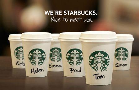
- Starbucks: In 2011, Starbucks debranded by eliminating the mermaid emblem from all of its products. The company’s goal was to portray itself as more refined and low-key.
- Dunkin’ Donuts, formerly known as Dunkin’ Donuts, Inc., has rebranded as simply Dunkin’ as of 2019. The business’s goal was to develop a more contemporary and minimalist brand identity.
- KFC: In 2015, the adjective “fried” was dropped from the KFC brand name. The business’s goal was to promote its better food alternatives and present itself as a forward-thinking, health-conscious enterprise.
Avoid Debranding?
Brand refreshment is a powerful tool for businesses. When executed well, rebranding refreshes a company’s image and reveals how far the brand has come. It also aids in the right placement of items in response to changing customer tastes. When executed incorrectly, the product becomes unrecognisable and obsolete.
- The Gap. -The denim retailer abandoned its classic monogram in favour of a Helvetica bold nightmare in 2010. When the corporation wanted to go from “classic American” to “modern, sexy, and cool,” it ditched its distinctive stretched typeface in favour of a generic, block letter boring that looked nothing like the old one save for a blue gradient square sticking out of the “p.” Only a week later, the Gap saw it had made a mistake and publicly apologised, saying, “we’ve learned just how much energy there is around our brand, and after much thought, we’ve decided to go back to our iconic blue box logo.”
- Kia- Google trend data reveals that the number of individuals Googling “kn car” has surged to over 30,000 searches per month since the logo’s appearance, suggesting that people are confused about whether or not Kia is still in business.
Keep in mind that there will always be a need to rebrand since there will be new design trends to adopt and executives that need a “fresh look.” However, to build a strong brand identity, businesses need a strategic plan to support their branding efforts.

Many car companies are simplifying their logos (which have long been inherently 3-dimensional chrome pieces on the cars themselves) to something that the sensor array for adaptive cruise control/automated emergency braking can be tucked behind. This can be seen with Nissan and VW but not Kia which has been applying their new logo to the forward edge of the hood, a decal over sheetmetal. But in any case it’s an industry-specific analog to “prioritizing mobile”.