The Fanta Rebrand – Getting More Playful
The fun brand Fanta got a makeover and the new branding has made it more playful and extendable to all flavours
Fanta has changed its logo, just like Pepsi and Sprite have, and the results are great. A redesigned wordmark and brighter colours make up the new worldwide brand identity for the beloved drink. The new design will make you happy and take your taste buds on an exciting journey.
The design team of Fanta’s parent company, The Coca-Cola Corporation, collaborated with Jones Knowles Ritchie to redesign the beverage brand to give it a more youthful, universally appealing vibe.
One of Coca-Cola’s most jovial trademarks is Fanta, the branding was too serious and didn’t convey a sense of fun. The concept of fun and play needed to be presented to an older audience too, but at the same time, it had the feel of being aimed at a younger one. A fun brand, in the end, has to be, well, fun.
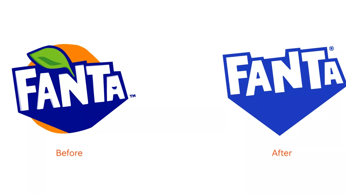
The new branding eliminates unnecessary elements and creates a minimalist flat logo. The typography has been cleaned up by getting rid of the shadows and a smiley face symbol that used to reside inside the second A. The broad shadow was rendered in a lighter shade of blue and stretched downward to create a point.
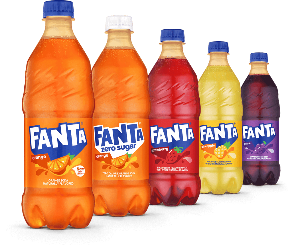
The design team decided to remove the orange roundel and leaf from the Fanta logo so that it could be used for all of the flavours, not just the orange one.
The new brand identity needed to be a true representation of the Fanta brand. It included giving due consideration to every nuance of existence. Consider the former logo; it featured an orange, but the company offers many other varieties as well. Although orange is the most recognizable flavour of Fanta, none of the other flavours has to suffer because of it.
Instead of having various logos for different locations, the new Fanta logo will be used globally for the first time. One of their biggest markets was the United States, which did not share their identical identity.
There were now two unique manifestations of the brand (with a few exceptions). There was the American version of Fanta, which had a more innocent design and a recipe similar to other soft drinks sold in the United States. The international version, used in 80% of Fanta’s markets, had a prominent logo bursting out of the iconic orange, and its formulae varied by the quantity of orange juice and natural flavours and/or colours they included.
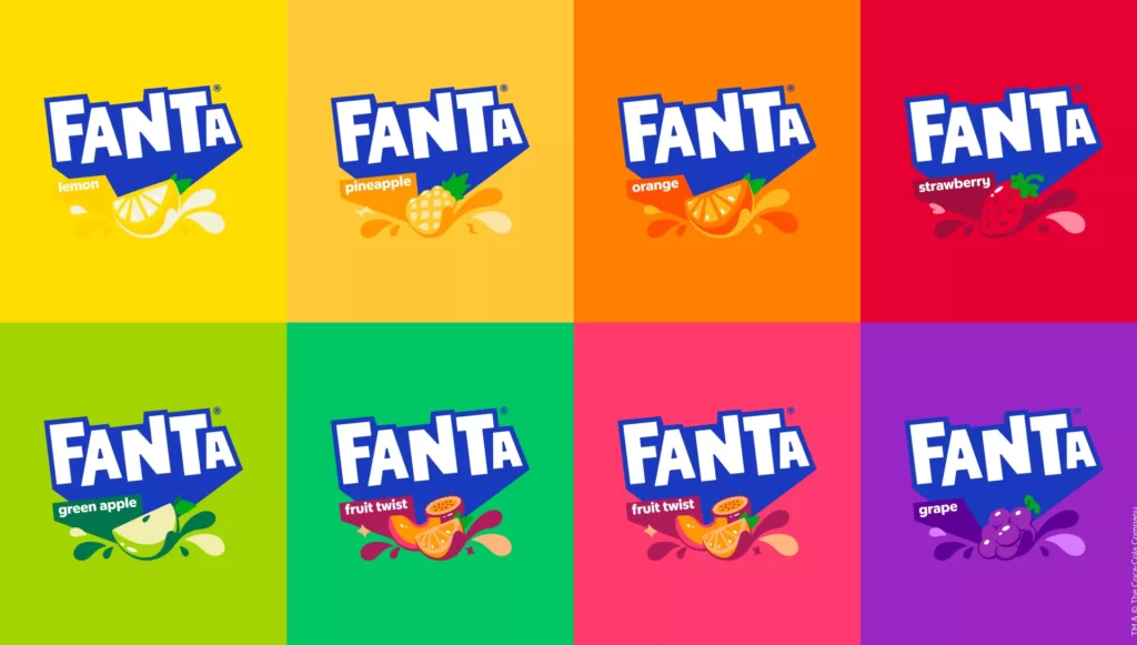
The goal of this rebranding effort was to create a unified brand across all teams.
There had to be a unified brand identity, which had to be kept up for the foreseeable future. It was also about expanding upon what consumers already loved about Fanta rather than completely changing the brand’s character.
I think the new branding successfully conveys a sense of carefree enjoyment.
Even though taking the orange out of the logo was a practical choice, the lack of the fruit and stem at a time when artificial sweeteners are becoming more popular in the mainstream beverage business may be going against the grain.
Like a gulp of anything, time will tell how it will all go down.
Reference
https://www.creativebloq.com/news/fanta-rebrand
https://www.fastcompany.com/90875506/exclusive-fantas-new-logo-ditches-the-fruit-just-like-its-soda