Toblerone – A Rebranding for the Better
In a market saturated with conventionally shaped candies like squares and rectangles, Toblerone deliberately developed a visual brand that celebrates its unconventional shape.
The government of Switzerland threw a spanner in the works. As part of an effort to meet the rising demand internationally and strengthen the Toblerone, Mondelez decided to shift manufacturing partially to Slovakia, necessitating the removal of the Matterhorn and the Swiss flag from its packaging. The Matterhorn will no longer be featured on Toblerone packaging, since the company that makes them is situated in Illinois and not Switzerland.
Mondelez International will also alter the packaging to exclude the Swiss flag. The Swissness Enforcement Association, an organisation that, well, enforces Swissness on the government’s behalf, has requested the revision. In 2017, Switzerland approved a regulation intended to preserve the distinctive Swiss character of a number of consumer goods. It is required by law that at least 80% of the ingredients in every food product sold in Switzerland be sourced domestically. In addition, the procedure that imparts a product with its distinctive Swiss character must take place inside the country. There is an even more stringent set of regulations around chocolate. Although cocoa isn’t a necessary ingredient since it doesn’t grow in Switzerland, milk is the foundation of chocolate. It must be entirely Swiss.
Hence, it was time for a rebrand!
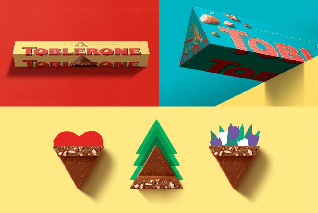
The 14,692-foot mountain with the hidden Bernese bear inlay no longer appears, and a “generic mountain” took its place. A revised logo and signature from the brand’s creator, Theodor Tobler, were included on the new packaging, which also featured a unique new Toblerone font.
Toblerone hadn’t been updated in a while. The goal of the rebranding was to put Toblerone’s strengths to use by giving the brand a fresh lease of life and expanding its horizons.
While chamois (the cream colour), red, black, and gold – still make up the basic colour palette of the new identity, the shift to brighter colours like teal, orange, and magenta is the most striking difference between the old and new designs. Particularly in a digital context, the bright hues connote a sense of newness.
The brand’s “Seasonal Chunks” are an extension of the brand’s primary visual identity. It has images from Christmas, Valentine’s Day, and Easter and aims to restore an intellectual wit to Toblerone.

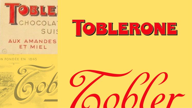
Bulletproof, the agency doing the rebrand, also looked to history for motivation. Archival research turned up a very interesting version of the Toblerone logo from 1908.
Because of this, the wordmark was revised (to make it more legible), and an original font, Tobler, was designed.
The Tobler signature, for instance, is used in a variety of contexts. It was introduced to show that the brand had been committed to excellence for generations.
It also included a picture of a Toblerone piece on the package so that consumers could easily choose their favourite flavours.
The rebrand was also intended to honour Toblerone’s “rich and eccentric” history while moving beyond the brand’s stale visuals. Instead of letting the brand’s identity wither away into uniformity, it celebrated its unconventional beginnings with vigour, relevance, and significance.
Is Toblerone in danger? In my opinion, it is very unlikely, and I will explain why.
Reviving an existing brand
To begin, for the first 62 years of its existence, the brand did rather well with a mountain (though, in fact, many people do not even realise it is the Matterhorn). Mondelez might miss the Matterhorn, but putting up a generic mountain that looks Swiss is sure to please customers.
The new typeface and package design introduced by Mondelez pose the greatest threat. The very opposite of what was intended might happen when a brand’s individuality is lost in the process of updating the brand’s visual identity and messaging. Nevertheless, doing nothing comes with its own set of risks that are just as serious. In addition to an ageing consumer base and new competition, freezing a design for decades results in a dusty, old-school image.
Redesigned packaging that seems like a new version of the original is the holy grail of reviving an old brand.
Origin does not carry a huge weight.
While it has been accepted as marketing doctrine for decades that the product’s origin should be central to the brand’s identity, the evidence supporting this claim is shaky at best. It’s possible that we previously resided in a time when ‘German-made’ was integral to the allure of a brand or when Japanese technology was seen as superior. Yet, in today’s complex economy, where parts are often assembled elsewhere and materials are sourced from throughout the globe, few manufacturers still do everything in-house.
Modern businesses understand that a brand’s “home” is more about its image than its actual origin. Case in point: Apple devices are famously ‘Designed by Apple in California’ yet ‘Assembled in China’.
Image is more important than context
Just chalk it up to an inevitable byproduct of globalisation. The ultimate postmodern implication of what it is to be genuine. Nevertheless, shoppers aren’t only uninterested in where their goods come from; they’re also fine with a skewed representation of the items’ origins and histories.
Origin is no longer an issue for consumers.
Modern businesses understand that a brand’s “home” is more about its image than its actual origin. Since there is no longer any need for authenticity or provenance, the desired impression is often bolstered.
Keeping a brand’s stance consistent frequently necessitates a company to relocate from its original location, further emphasising the importance of image over origin. not despite, but rather thanks to, the brand’s image.
As a result of China’s lower production costs and larger market, several high-end companies have moved their factories there.
Most astute businesses intentionally combine their symbolic and real origins until they are indistinguishable even to knowledgeable customers. Burberry switched to a manufacturing model that remains global. Product manufacturing has moved to Italy, and China, apart from the United Kingdom. The brand will not only survive this contradiction, but it will also grow because of it, as long as some of its products are still made in the UK and all of its communications have the typical Britishness emphasized.
Fortunately, Toblerone is not in any danger. Production in Slovakia and the lack of a Swiss mountain on the box won’t hurt the product’s uniqueness or sales. There will be a significant increase in sales, a more Swiss-looking non-Swiss mountain, and expanded manufacturing facilities in Slovakia.
Reference
https://www.creativebloq.com/news/toblerones-wordmark
https://thedieline.com/blog/2022/7/11/bulletproofs-redesign-of-toblerone-is-peak-triangle?